Rebranding Orthodoxx
Rebranding Orthodoxx
Orthodoxx, a CGI design studio in Amsterdam, wanted a fresh, cohesive rebrand to stand out and bring more consistency to their socials.

The Process
It’s easy for a 3D studio to make 3D the center of its branding, but Orthodoxx isn’t a standard studio. This rebrand needed a fresh approach. The goal was to create a bold, eye-catching identity where every post felt like a work of art—while also keeping it simple enough for Orthodoxx to apply themselves. Striking the balance between unique and easy to execute was the challenge.
The Wordmark

The logo had to be clean and minimal to avoid competing with the playful branding. The solution? A distinctive sans serif, Anybody ExtraExpanded, with the ‘O’ rotated 45 degrees—subtly reinforcing the studio’s unorthodox nature.

The Colors
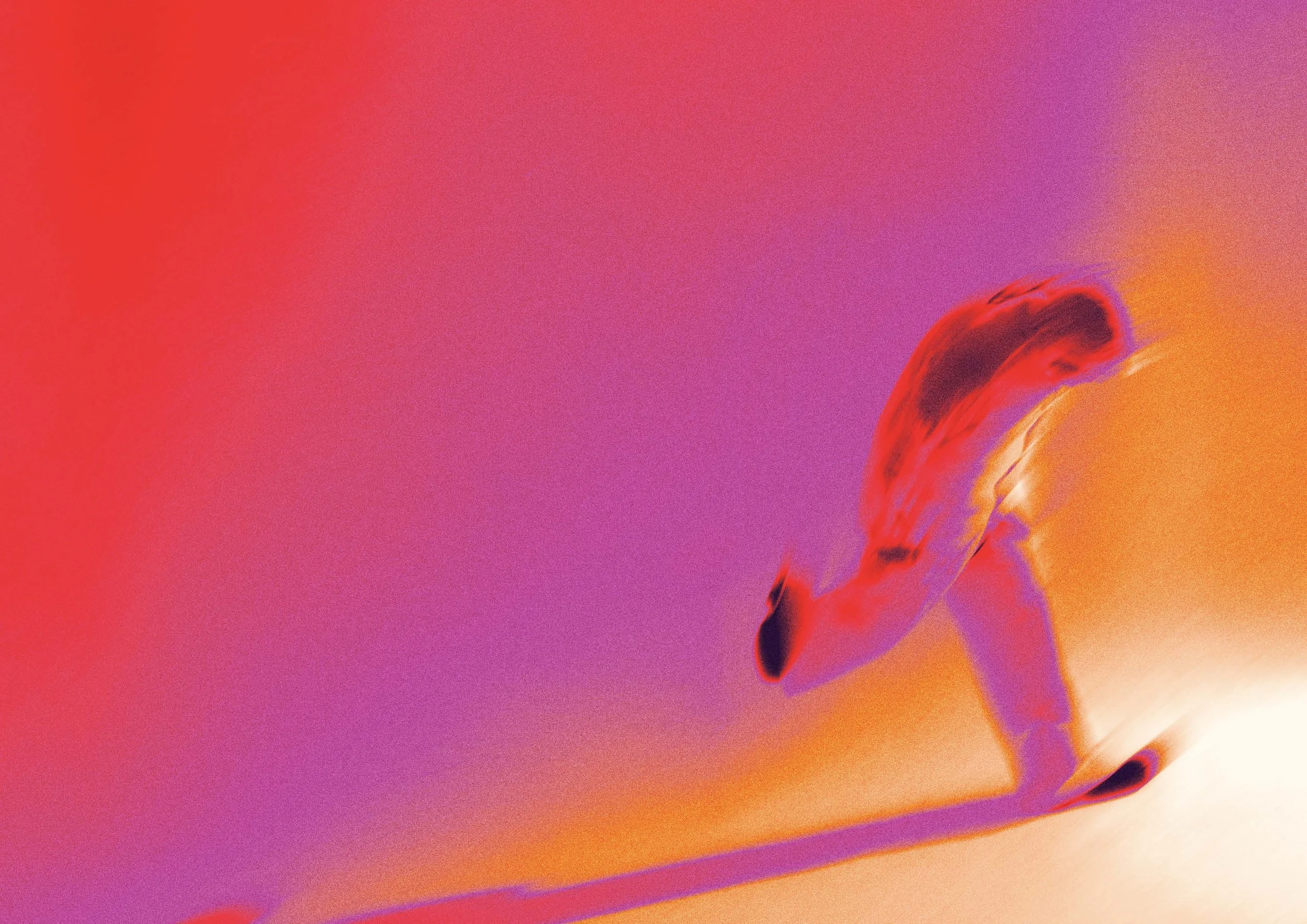
The grainy, motion-blurred aesthetic instantly clicked. It keeps the branding dynamic and tied to cutting-edge design trends, while the warm, playful colors prevent it from feeling too rigid or serious. This effect is easily applied in a single click using a custom Photoshop action.


Typography
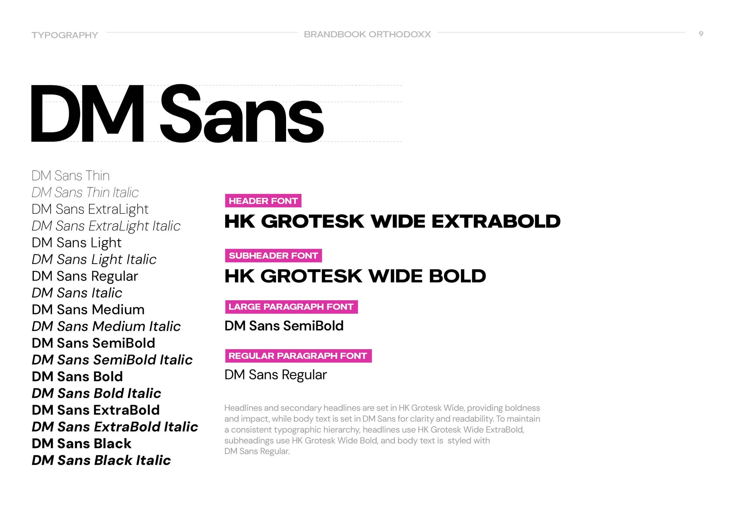
To maintain a professional feel, typography plays a key role. HK Grotesk Wide gives titles a strong but distinct presence, while DM Sans balances things out for longer copy—blending playful with polished.

Motion
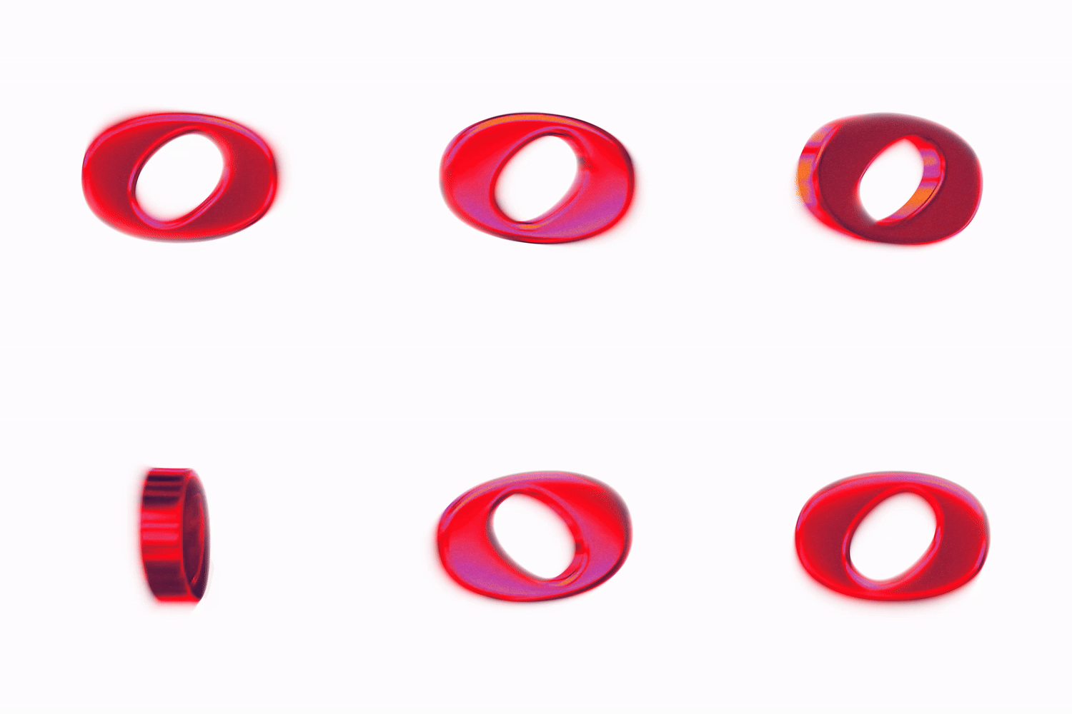
A branding system like this wouldn’t be complete without an animated logo. For this, the secondary logo was built in 3D and turned into a simple motion sequence. Then, frame by frame, a custom Photoshop action was applied to keep the animation visually consistent with the rest of the brand. This piece will be used across decks and social media, reinforcing the identity in motion.
